Now Reading: Responsive Web Design Techniques: Media Queries & Fluid Layouts
-
01
Responsive Web Design Techniques: Media Queries & Fluid Layouts
Responsive Web Design Techniques: Media Queries & Fluid Layouts

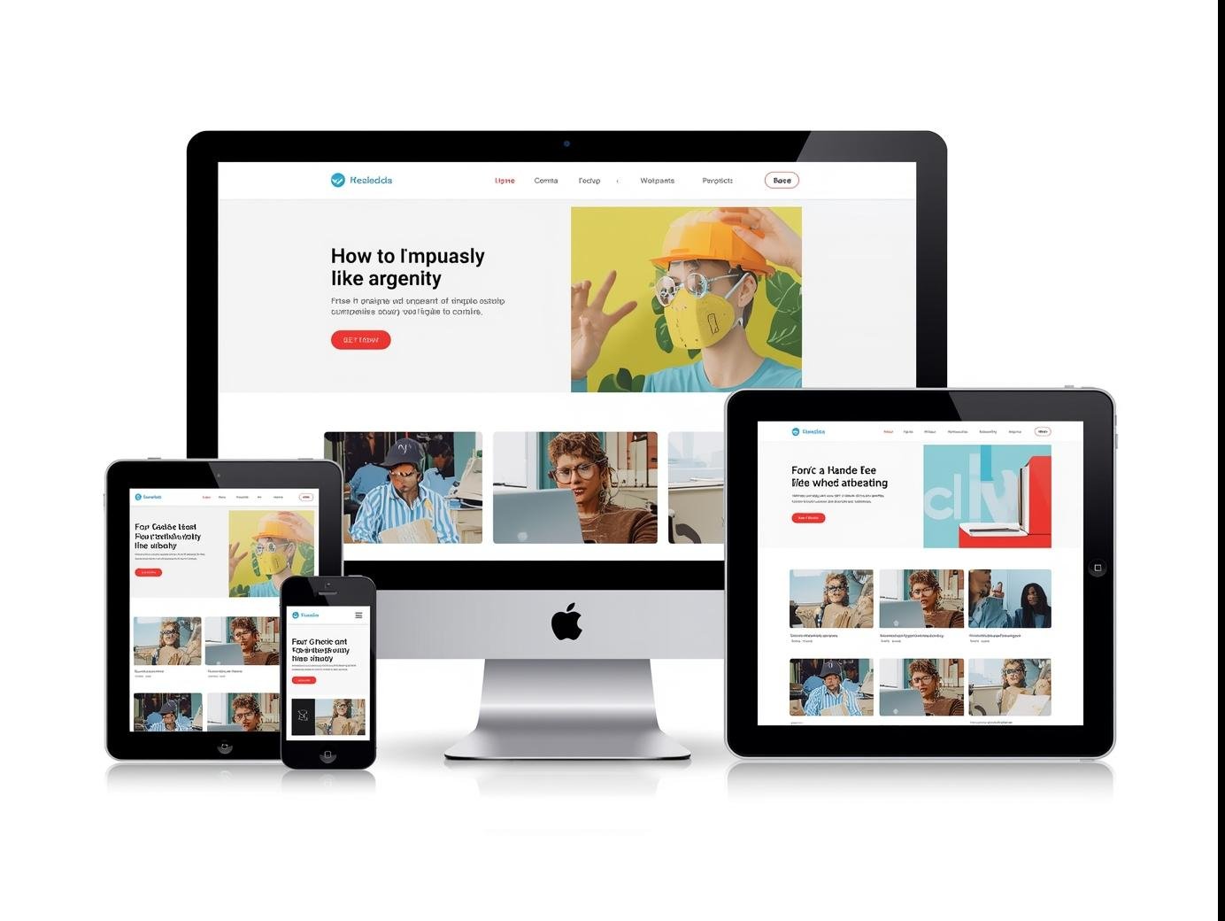
In today’s digital world, your website is often the first impression you make on your audience. Whether a visitor opens your site on a laptop, tablet, or smartphone, they expect a smooth, visually appealing experience. That’s exactly where responsive web design comes in.
At Smart Life Solutions, we understand the importance of creating websites that look great and function seamlessly across all devices. Let’s explore two of the most effective techniques behind responsive design: media queries and fluid layouts.
Why Responsive Design Matters
Think about your own browsing habits. How often do you visit a website from your phone instead of your computer? According to recent studies, more than 60% of web traffic comes from mobile devices. If your site isn’t responsive, you risk losing visitors (and potential customers) simply because your design doesn’t adapt to their screen.
Responsive design ensures:
-
Better user experience
-
Improved SEO ranking (Google prioritizes mobile-friendly websites)
-
Higher conversion rates
Technique 1: Media Queries
Media queries are like special instructions you give your website to adjust based on screen size. For example, you can tell your site:
-
If the screen is smaller than 768px, stack elements vertically.
-
If the screen is larger than 1200px, show a wider layout with more spacing.
This way, your design is never fixed—it’s flexible and adapts gracefully.
Example CSS snippet:
This simple rule ensures text remains readable and layouts remain user-friendly on smaller devices.
Technique 2: Fluid Layouts
While media queries handle responsiveness at specific breakpoints, fluid layouts allow your website to naturally scale with the screen size. Instead of setting fixed pixel values, fluid layouts use relative units like percentages (%) or viewport width (vw).
For example:
This approach ensures your website elements automatically resize, creating a smoother experience across devices without needing dozens of breakpoints.
The Human Touch in Responsive Design
At Smart Life Solutions, we believe web design isn’t just about code—it’s about people. A responsive website is like good customer service: it adapts to your visitors’ needs without them even noticing.
When users enjoy a frictionless browsing experience, they stay longer, explore more pages, and trust your brand. That’s the power of combining technical techniques with a human-centered approach.
Final Thoughts
Responsive web design isn’t just a trend—it’s a necessity. By mastering media queries and fluid layouts, you can create websites that feel natural on any device.
If you’re looking to build a responsive website that not only works but also connects with people, explore our services at Smart Life Solutions.
Because at the end of the day, great design is not just about screens—it’s about experiences.


