Now Reading: CSS Flexbox vs Grid: Use-Cases and Performance Comparison
-
01
CSS Flexbox vs Grid: Use-Cases and Performance Comparison
CSS Flexbox vs Grid: Use-Cases and Performance Comparison

When it comes to modern web design, two powerful CSS layout systems stand out: Flexbox and CSS Grid. Both are game-changers for developers, but understanding their strengths, weaknesses, and best use-cases is essential for building responsive and high-performing websites. Let’s explore how they compare in real-world scenarios.
What is Flexbox?
Flexbox, short for Flexible Box Layout, is designed for one-dimensional layouts. This means it works best when arranging elements in either a row or a column.
Key Features:
-
Perfect for alignment and spacing between items.
-
Handles dynamic content well (great for navigation bars or buttons).
-
Simple to use when you want responsive elements without too much complexity.
Example Use-Cases:
-
Navigation menus.
-
Centering items both vertically and horizontally.
-
Responsive form layouts.
-
Simple card layouts.
What is CSS Grid?
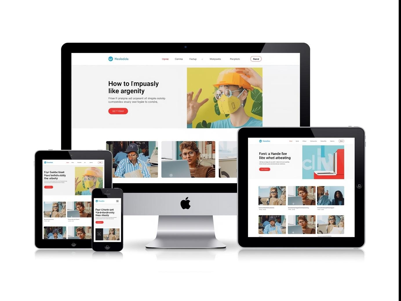
CSS Grid, on the other hand, is built for two-dimensional layouts. It allows you to control both rows and columns simultaneously, making it ideal for more complex designs.
Key Features:
-
Perfect for entire page layouts.
-
Gives pixel-perfect control over rows, columns, and gaps.
-
Allows overlapping and layering of elements.
-
Reduces the need for complex nested containers.
Example Use-Cases:
-
Website templates and dashboards.
-
Image galleries.
-
Complex landing pages.
-
Multi-section layouts.
Flexbox vs Grid: Performance Comparison
Performance matters when choosing the right tool.
-
Rendering Speed:
Both Flexbox and Grid are highly optimized by browsers, so the difference in performance is almost negligible for most projects. -
Use-Case Efficiency:
-
Flexbox performs better for smaller, linear layouts (fewer calculations).
-
Grid shines in large, structured layouts where managing rows and columns manually would otherwise slow down development.
-
-
Browser Support:
-
Flexbox has been around longer and enjoys wider compatibility across older browsers.
-
Grid is well-supported in modern browsers but may need fallbacks for legacy systems.
-
Which One Should You Use?
-
Choose Flexbox if you are working with simple, one-directional designs like navigation bars, buttons, or form elements.
-
Choose Grid if you are designing complete page structures, image-heavy galleries, or multi-section layouts.
-
Use Both Together: Many modern developers combine them. For example, use Grid for the overall page structure and Flexbox for aligning items inside grid cells.
Final Thoughts
Both Flexbox and Grid are not competitors but complementary tools. If you want efficient, clean, and responsive designs, learning when to use each is key.
At Smart Life Solutions, we believe in using the right tool for the right job. Whether you’re a beginner or an advanced developer, mastering Flexbox and Grid will help you create stunning, user-friendly websites.